Viiala

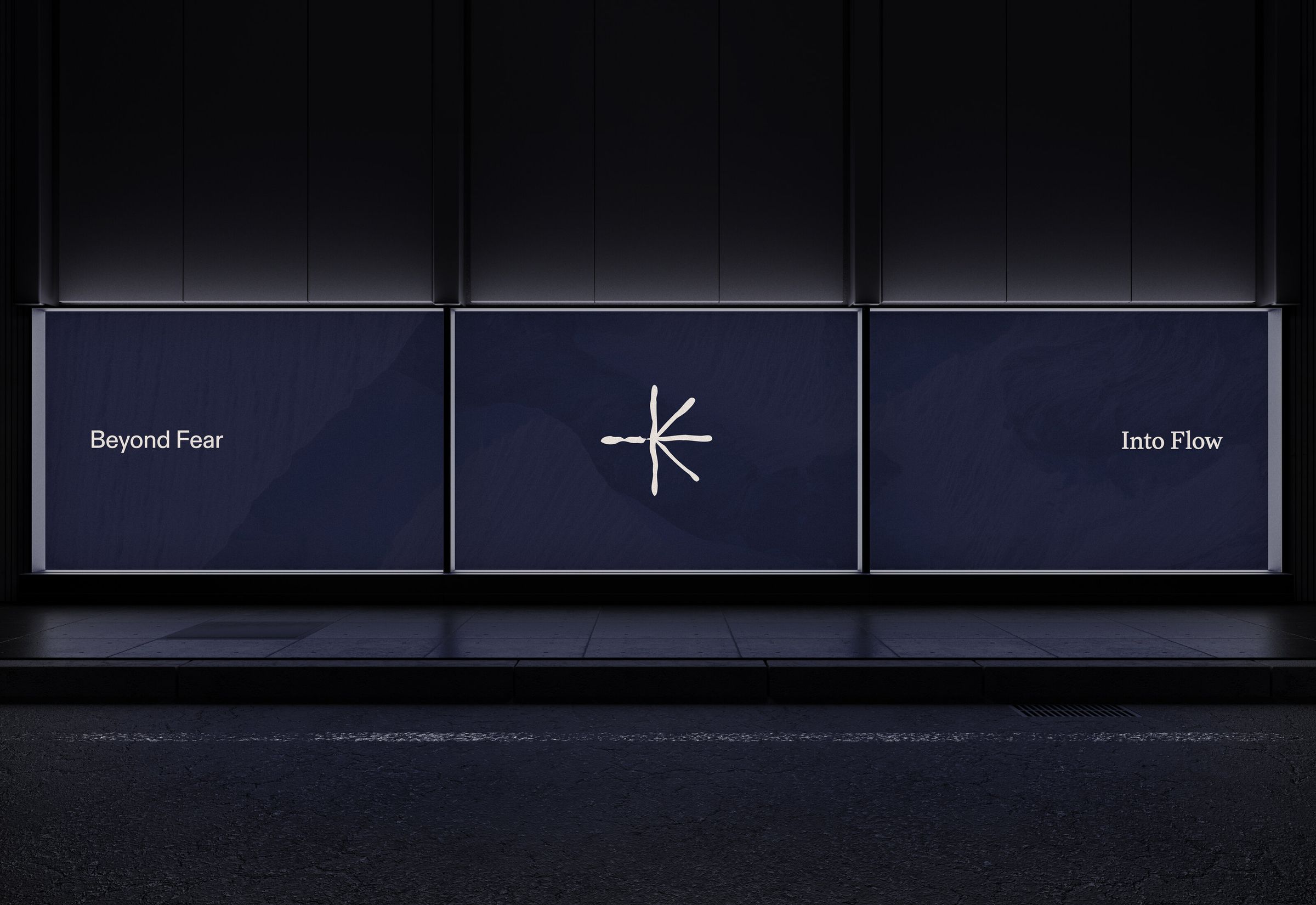
Brand development
Viiala
- Client
- Viiala
- Sector
- E-mobility
- Scope
- Brand development
The challenge
Build belief before you can build product.
When Tomi Viiala set out to create a new mobility company, he came to RIDE with a challenge with no easy shape. The first bike wouldn't ship until 2028. The product didn't exist - not as a prototype, not as a sketch, not as a spec sheet. What existed was an intention.
RIDE's job wasn't to design a bike. It was to build a brand strong enough to hold the space until the bike arrived - and confident enough that the waiting itself would become part of the story.
The positioning
Our competition is not other bike brands.
Viiala's competition isn't Specialized or Canyon. It isn't even other premium e-bikes. Viiala's competition is every other mobility option a person could choose.
This reframe removed Viiala from the spec race and placed it inside a larger question: what makes someone actively choose a bike, even when they don't have to?
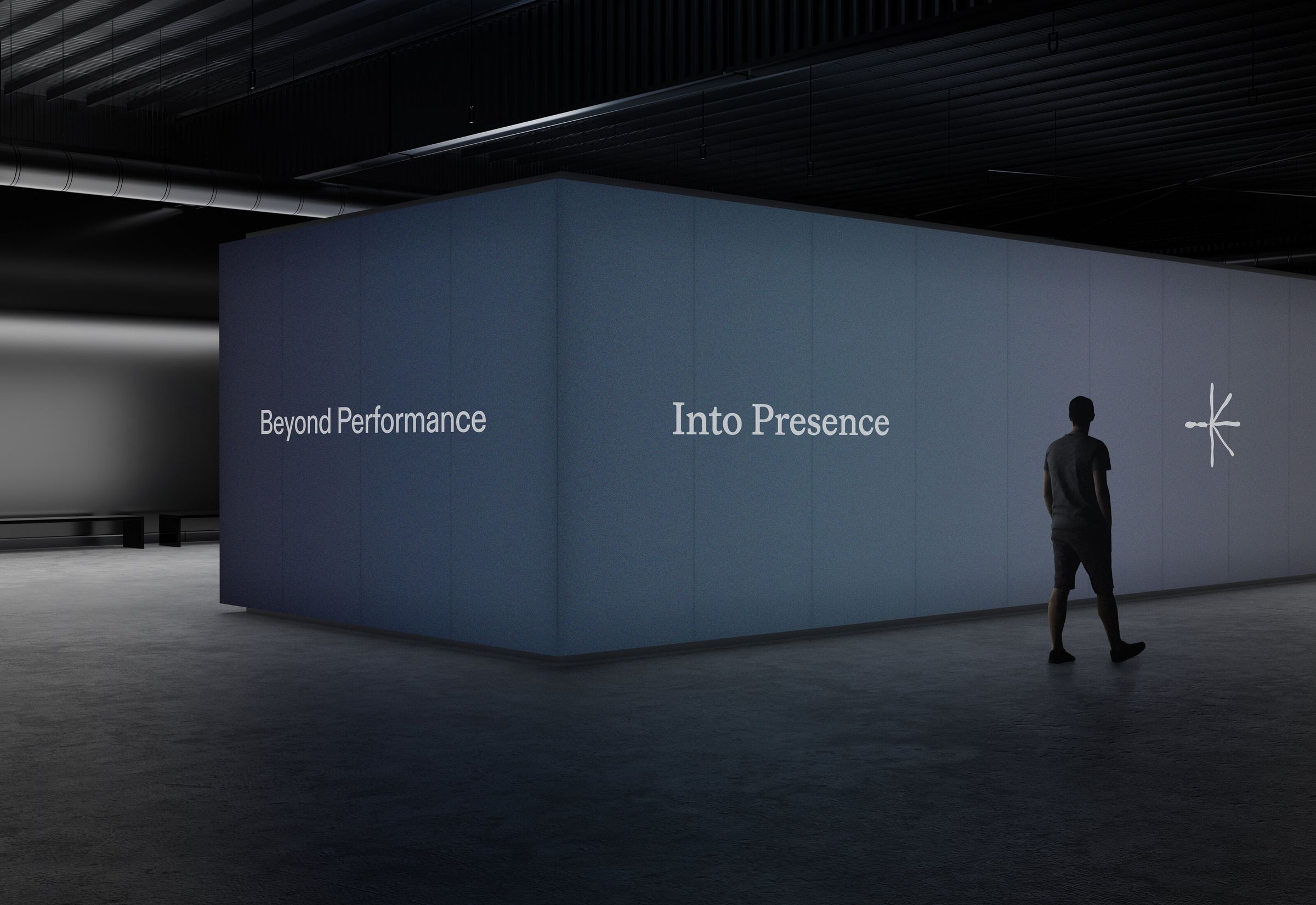
Beyond → Into
Beyond
- Performance
- Effort
- Fear
- Boundaries
- Distraction
- Force
- Struggle
- Doubt
- Anxiety
- Chaos
- Stress
Into
- Presence
- Ease
- Flow
- Breakthrough
- Direction
- Freedom
- Strength
- Discovery
- Assurance
- Coherence
- Stillness
11 of 22 pairs shown - the full matrix runs on viiala.com
The idea
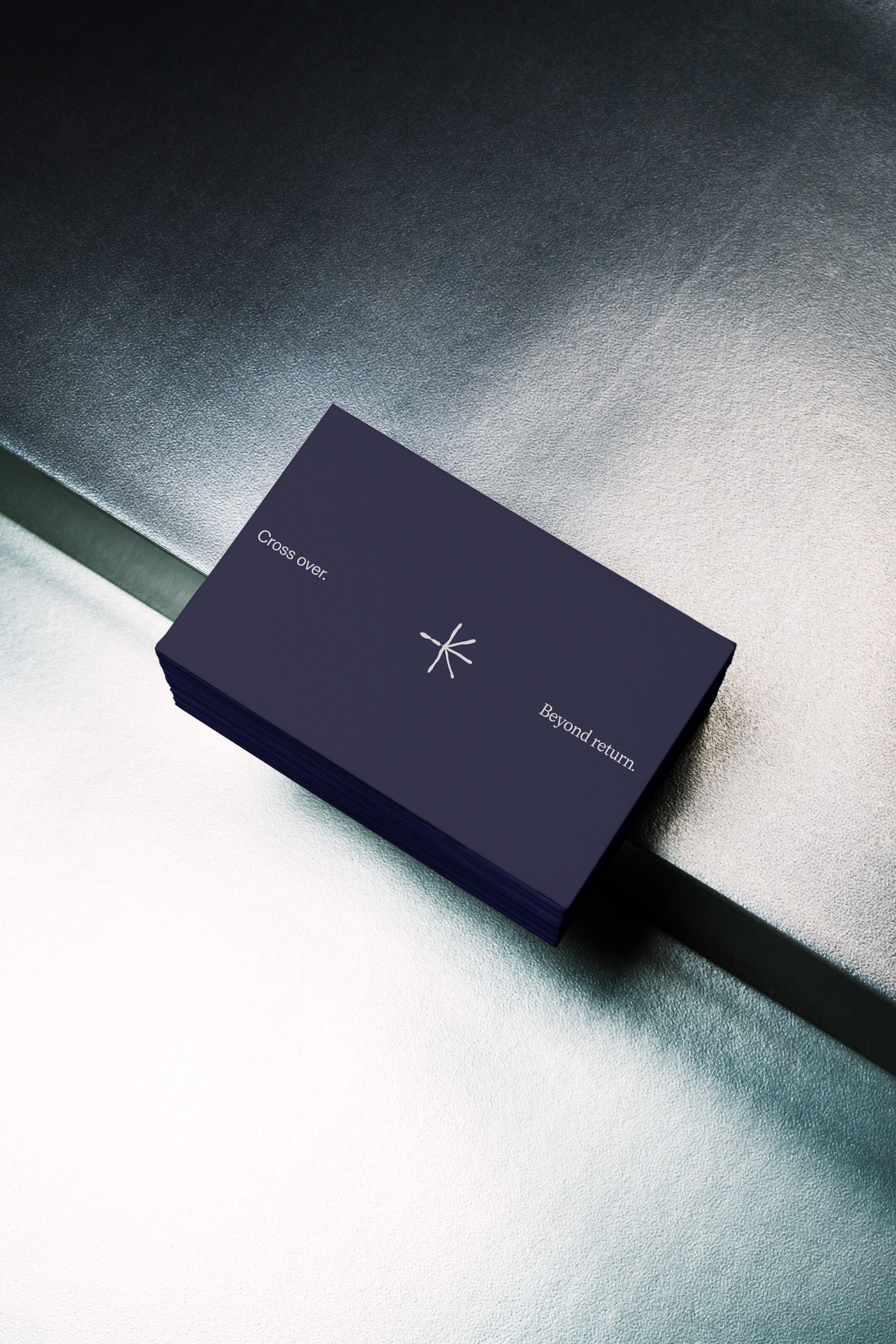
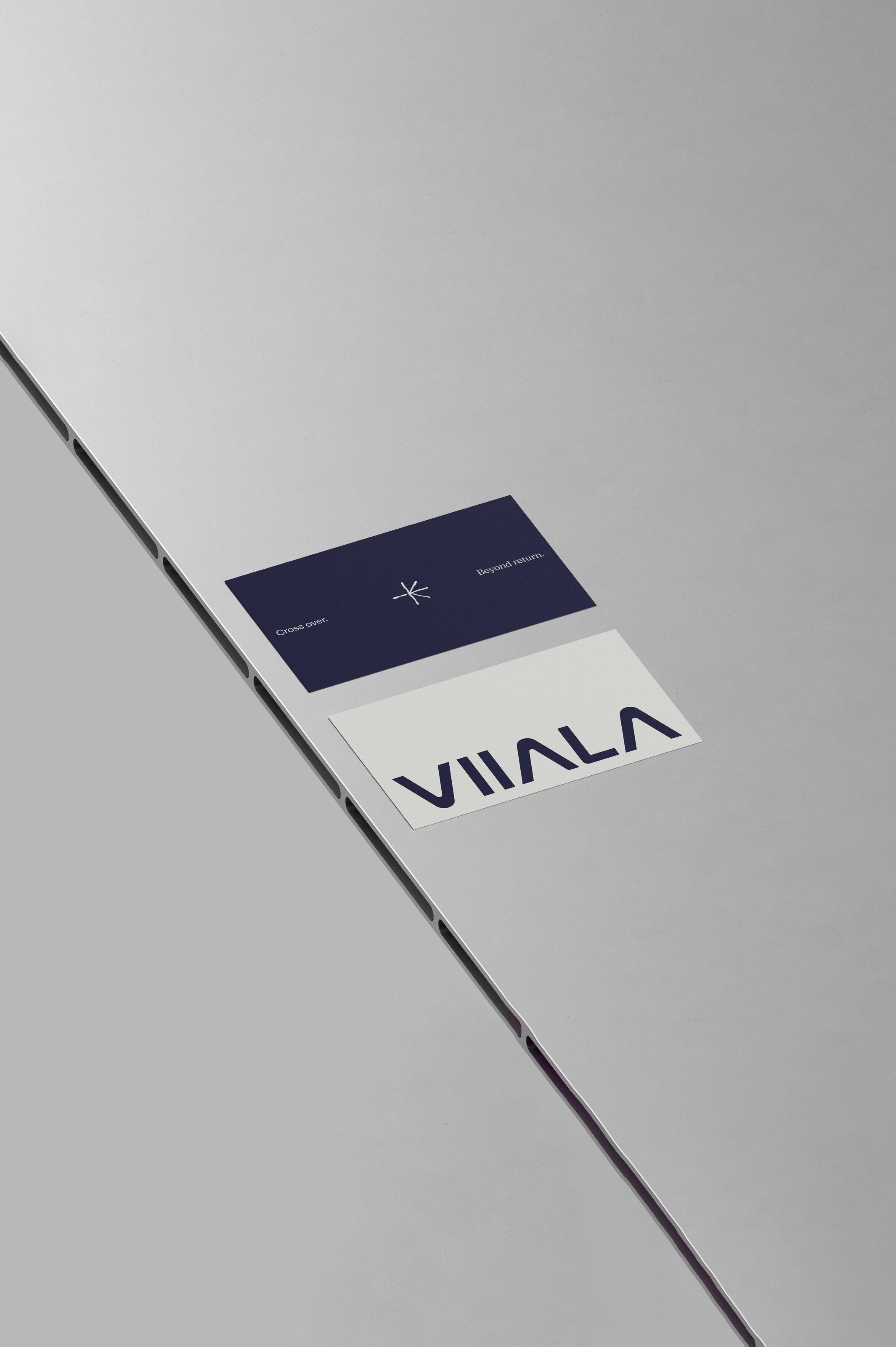
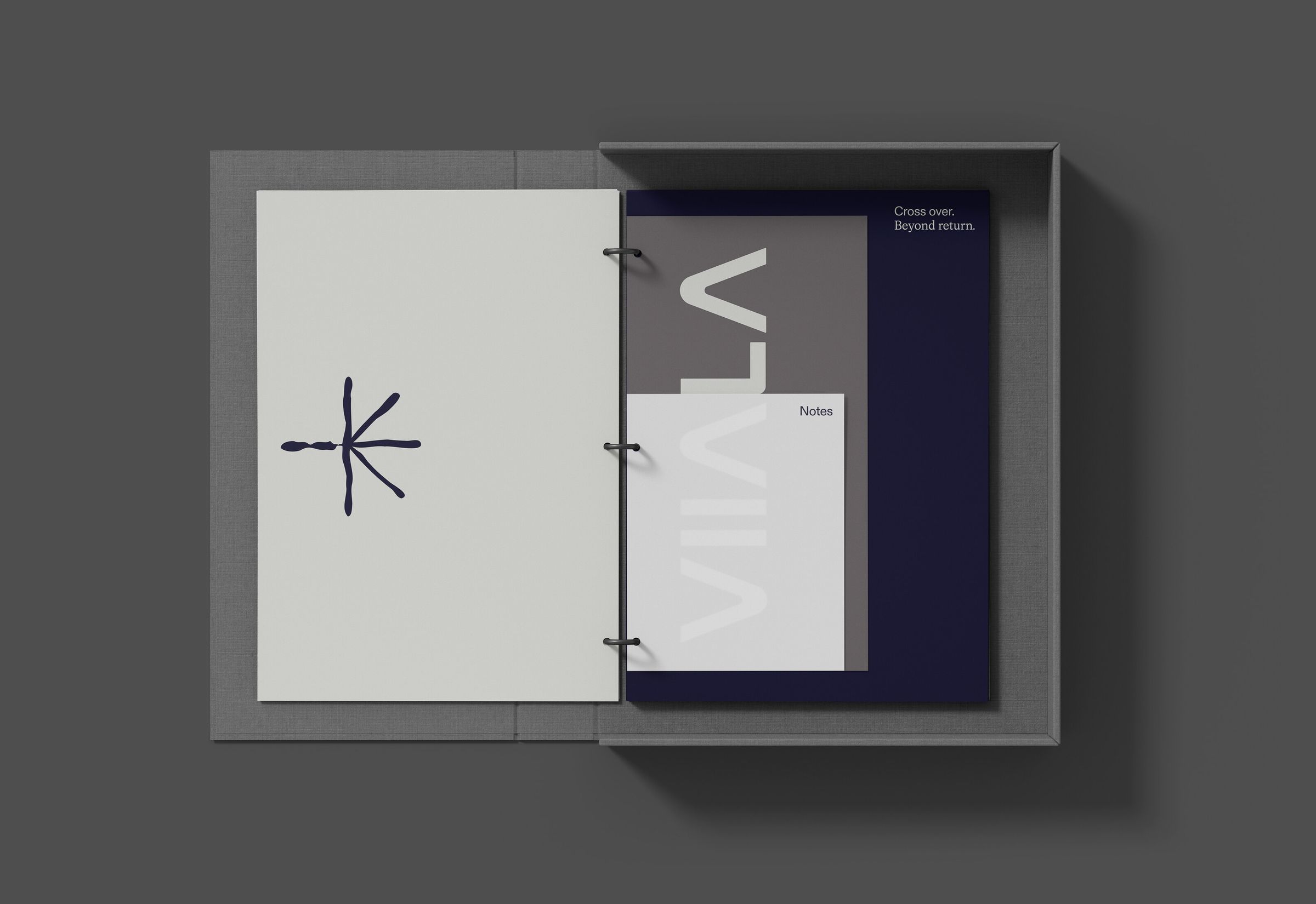
Cross over.
Beyond return.
There is a before Viiala, and an after. Once you cross the line, there is no going back without regression. The logic of a first ride. The logic of flow. The logic of transformation - the experience stays with you, and you carry it into the rest of your life.
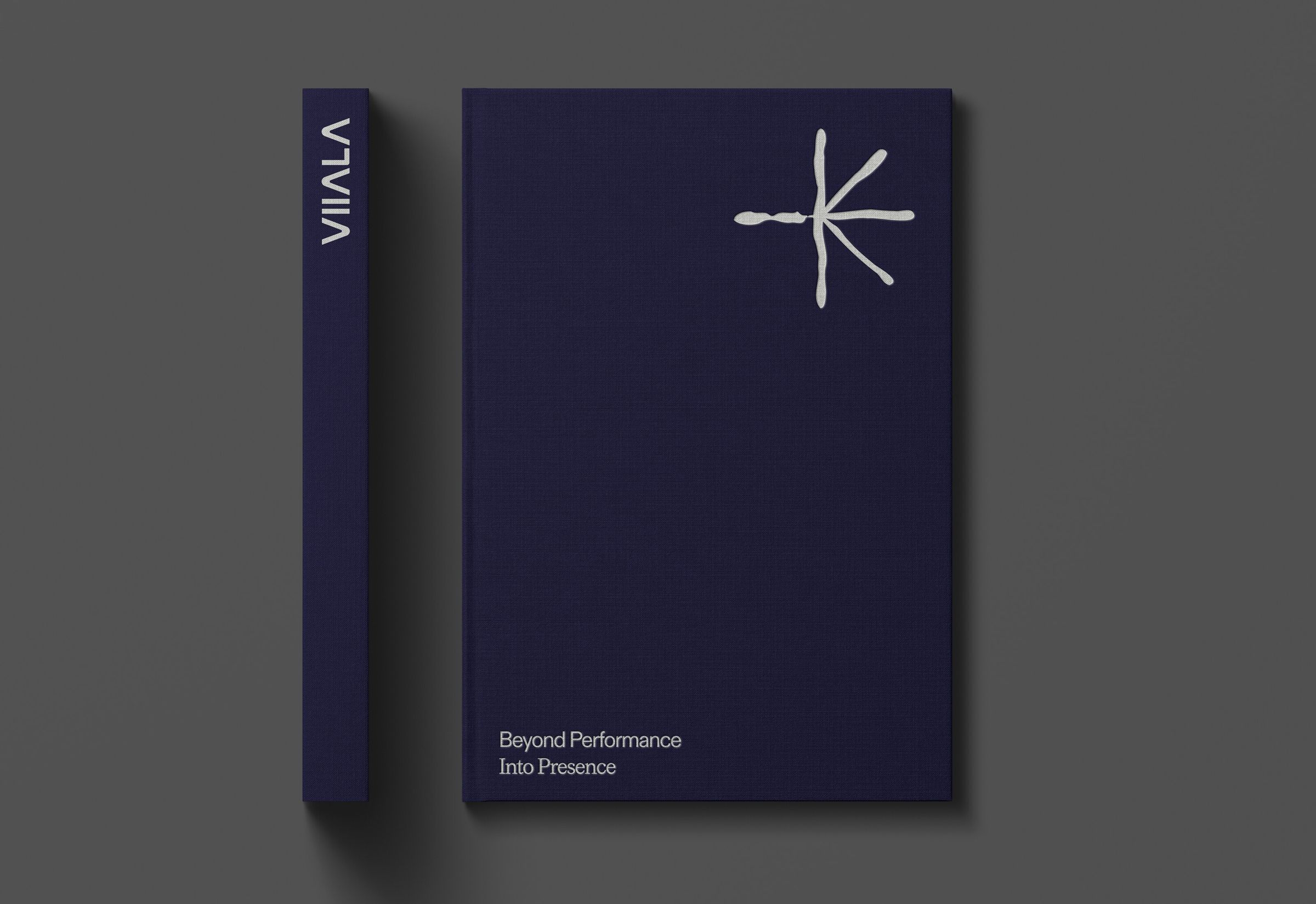
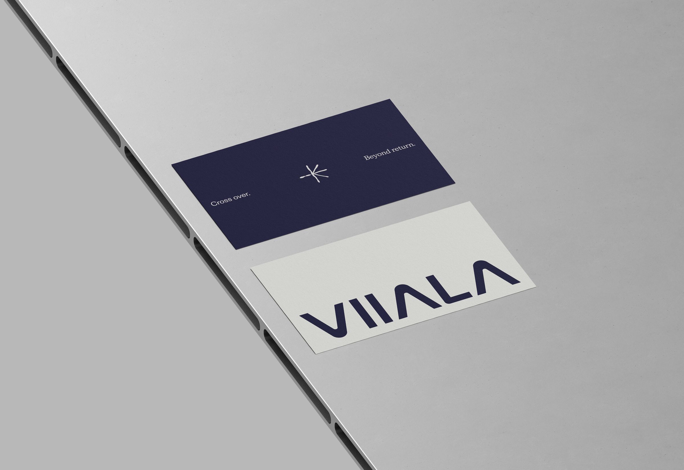
RIDE built the entire brand around this idea. Including a symbol that weaves all six letters V-I-I-A-L-A into a single hand-drawn mark.
The brand system
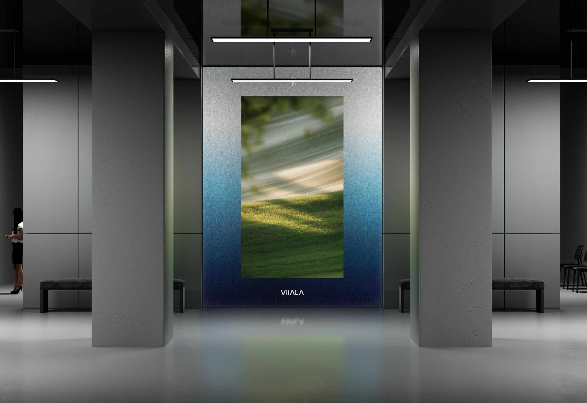
Every surface.
One voice.
Brand strategy. Naming. Manifesto. Voice. Messaging matrix. Symbol. Wordmark. Color system. Typography. Photographic direction. Full website. Brand film.
Even the AI chat persona - “I am the Soul of Viiala” - trained on the tone.
The website
Where the waiting becomes the experience.
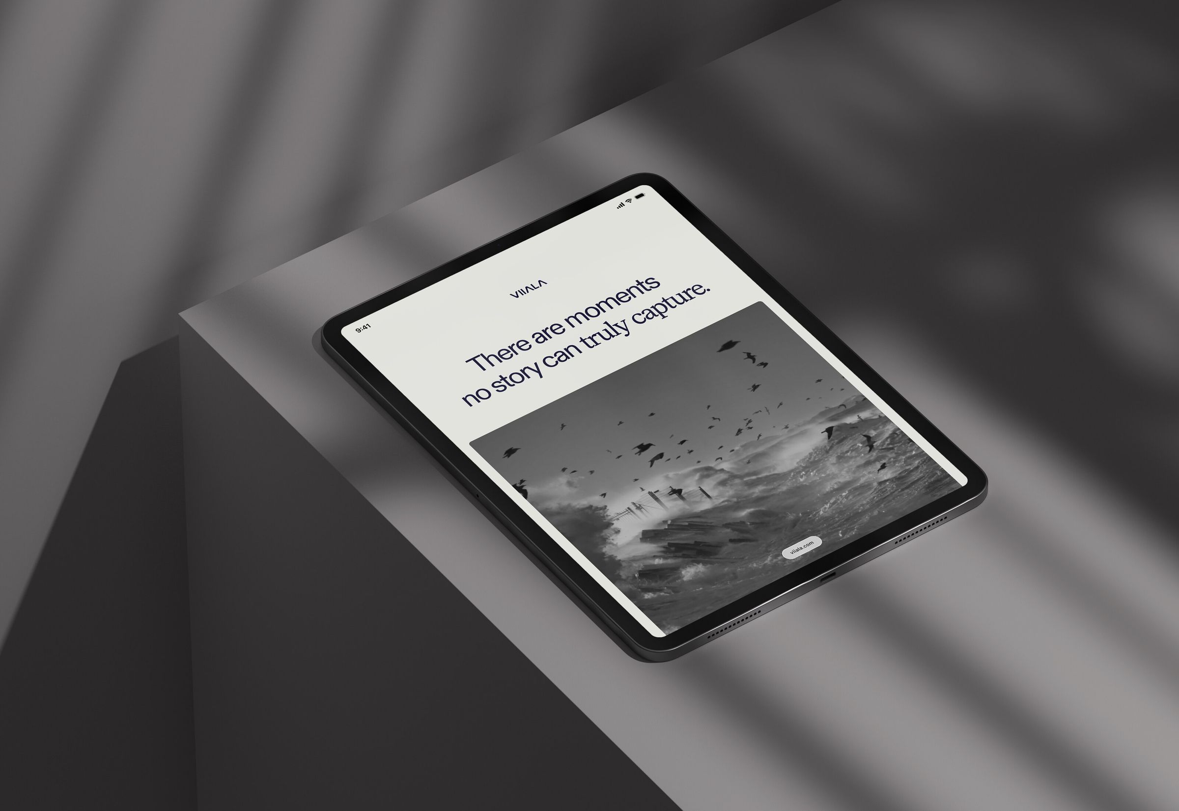
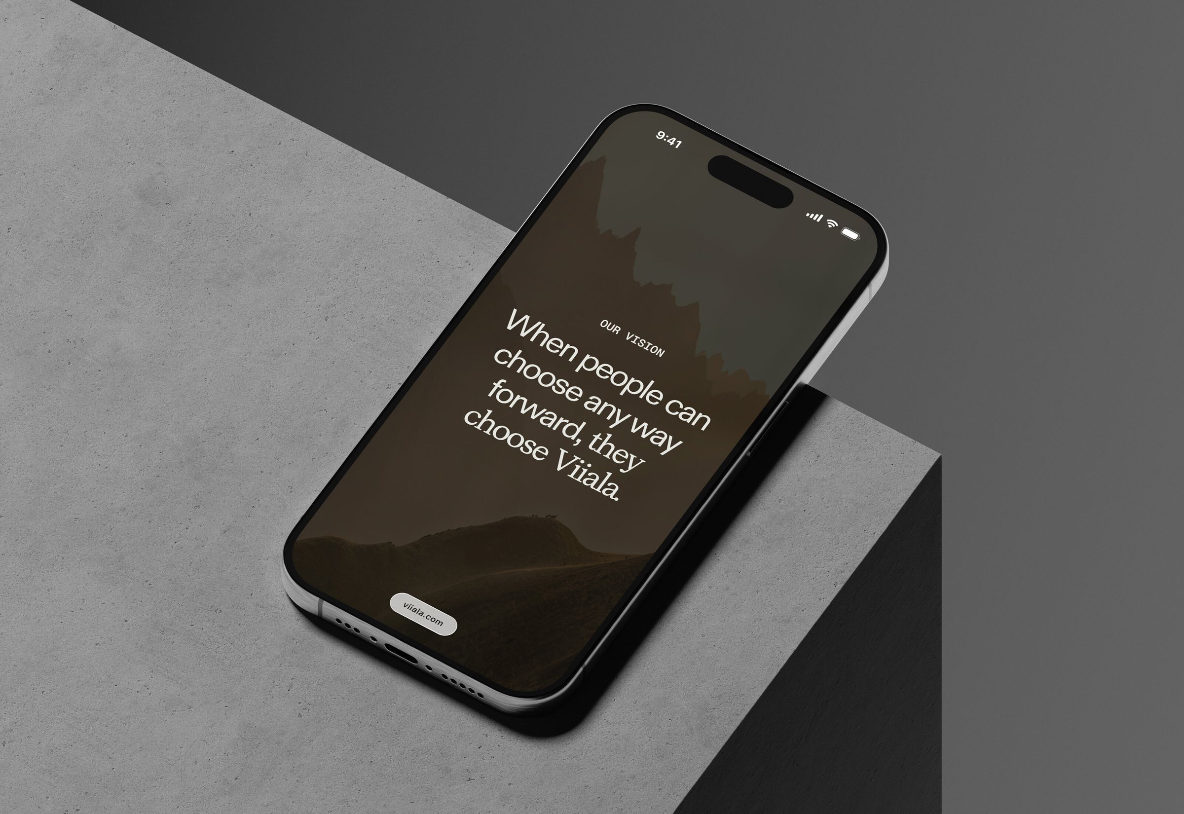
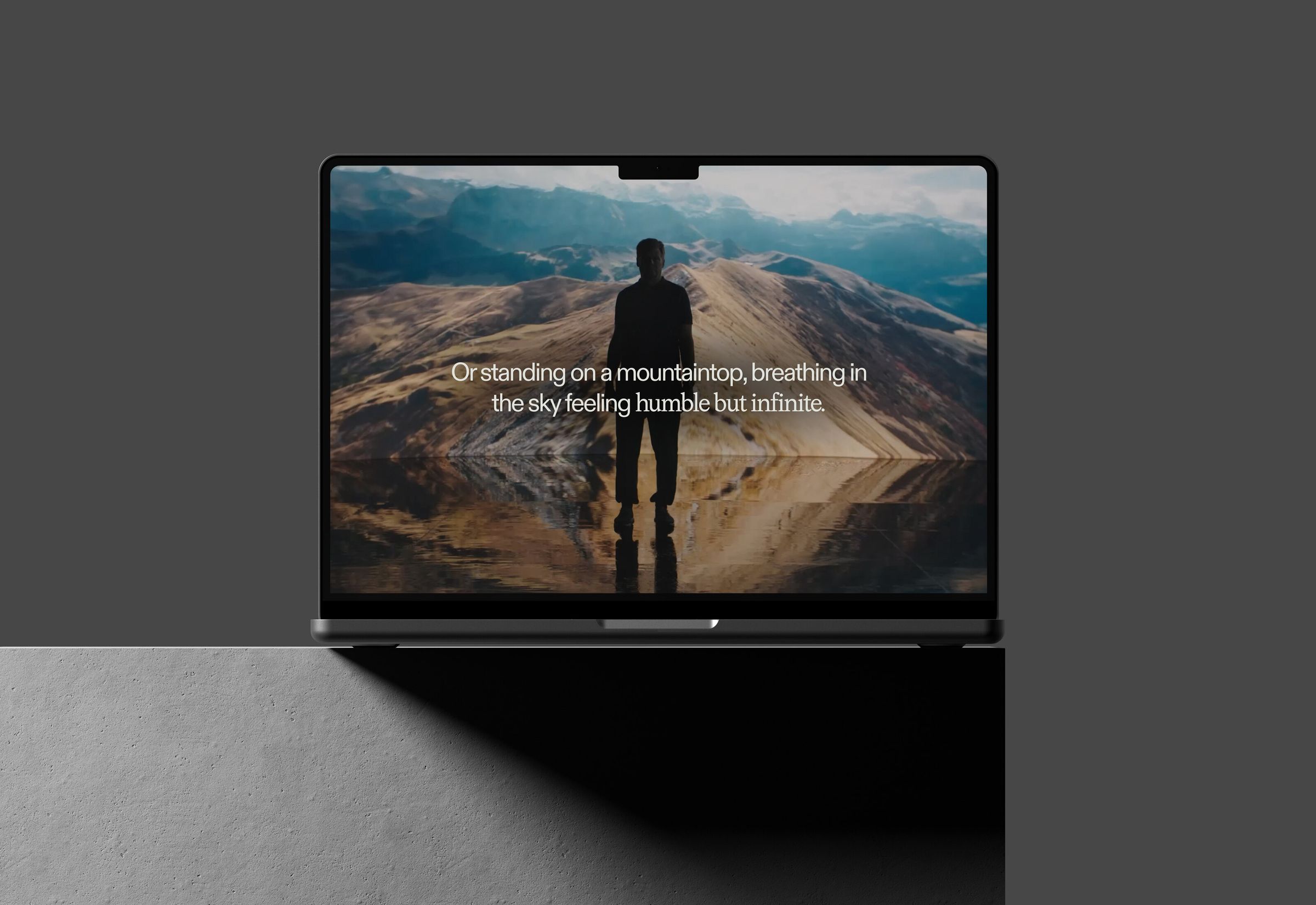
Viiala.com isn't a pre-launch page. It's a cinematic, fully-realized brand experience - brand film, story-beat videos, manifesto, founders, FAQ written in the brand's voice, a messaging matrix you can scroll through, a chat persona that speaks in the brand's tone.
Built by RIDE as the place where the brand lives until the bikes arrive.
The proof
In a world that moves too fast, the truly bold brands dare to arrive late.
In October 2025, cycling industry writer Juansi Vivo published “The Viiala Paradox” - an essay working through the tension of a brand launching three years before its product. He named the real risks.
And then, working through the paradox on the page, he arrived at the conclusion RIDE had designed the brand to produce. That wasn't positioning RIDE handed him. That was the brand doing its job.
The work behind the brand
RIDE's first full brand build.
Viiala is the first project where RIDE's work extended beyond product design into the full scaffolding of a brand - strategy, positioning, naming, manifesto, voice, visual identity, and the digital experience that carries all of it.
The absence of product forced every decision to be carried by story. That constraint turned out to be generative. When there's nothing to show, everything you say has to matter.
We don't care about design theatrics - we move the needle, and we defend it in the boardroom.
Want to move forward?
Start a real project.